Cinematography of Gunpowder Milkshake (2021)
What's good y'all!
So this action film just dropped on Netflix & I LOVE it. Sadly, I think it's gonna fly under the radar but I'm gonna give it it's flowers now. Check my review to hear my full thoughts on the film and go watch it if you haven't yet, & come back.
If you're still reading, I'm assuming you either watched it or don't care about spoilers because everything from this point contains spoilers. You've been warned, now let's get into these shots!
From the opening frame, you can tell what type of movie this is gonna be. We're in for a Neon drenched bloodfest that will be easy on the eyes. You'll also notice a running theme with colors being split 50/50 and close ups on the characters eyes and faces.
The title card speaks to what you're going to see. This film is an aesthetic journey that takes you different places and the color pallet matches it.
The Diner is such a vibe & there's a sense of mystery surrounding it when you're first introduced to it. Everything inside of it seems too perfect and staged, making it feel very uncomfortable.
The close up/split color scheme back into play. This movie is magnificently lit. Something like this seems so simple but it takes quite the setup to create. Specific bulbs, windows that cast light a certain way, the positioning of those windows, etc.
The light here is casted in a way that makes you question what you see. They look like shadows but that's exactly what they are. Shadow of the people they once were & when it hits, you understand just how lethal Sam actually is.
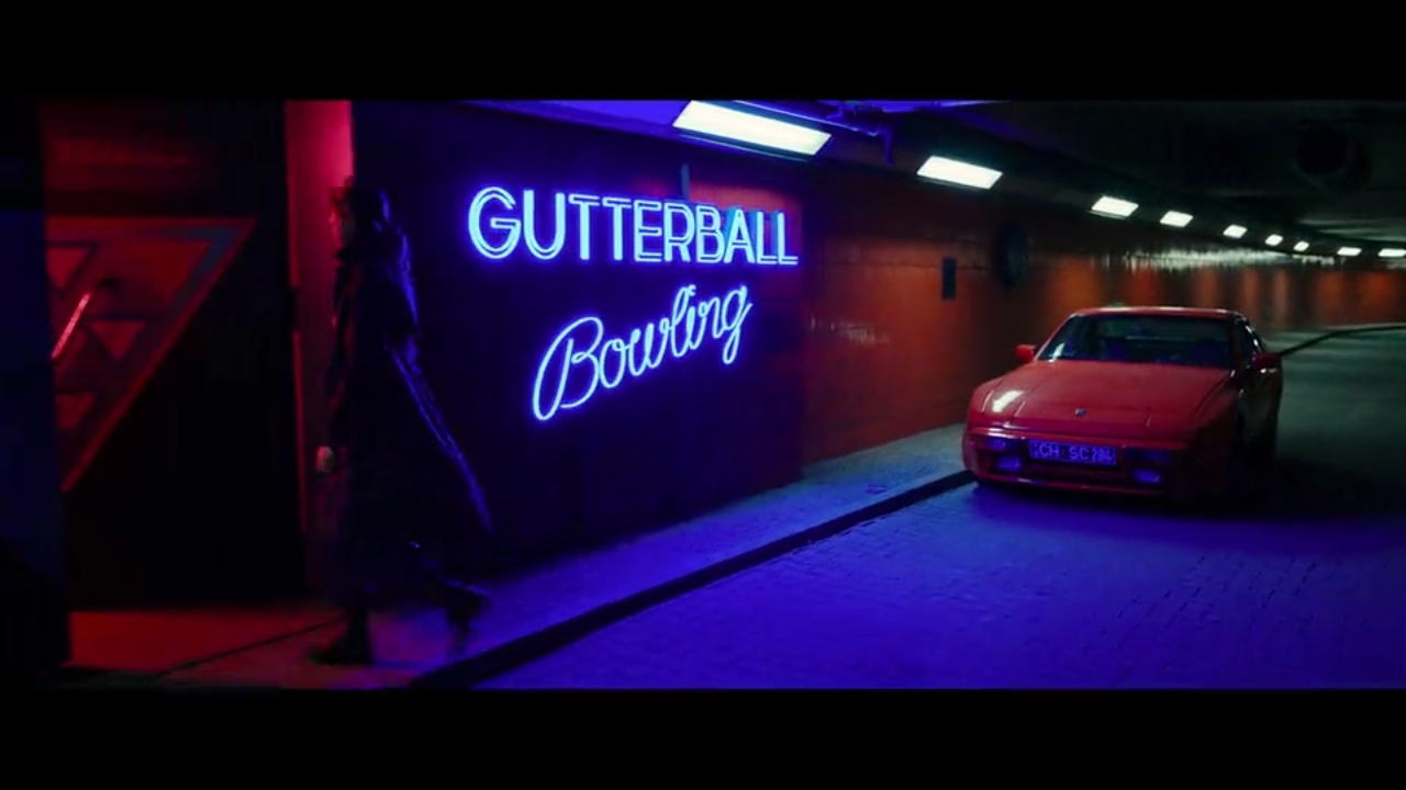
Picking a red Porsche 944 is such a great choice to use as, "the car," she drives. It adds a vintage flavor to the film in a subtle way that' isn't jarring.
This is where storyboards come in handy. The heart being the centerpiece of the shot can be taking many ways from the audience because of what's happening in this scene. For me, it signifies that he's losing his heart, while she's finding hers for the first time in adulthood.
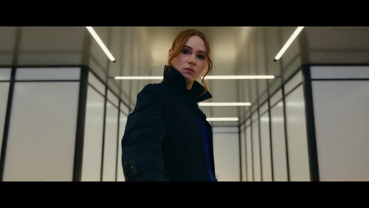
This is when costume design makes the difference in how this shot looks. The set and framing are already nice so this would look great with her wearing any color but that black/blue jacket really makes it pop even more.
I hate saying this but man is this movie a vibe. I know, I know. "It's just neon colors," and while that is true, it's all about the setup & execution. How do you marry these colors and are they accompanied by an atmosphere? In this case, YES. These two single shots draw you in to see what happens next.
Blocking 101 right here. Gorgeous shot and those masks are the icing on the cake. Those joints are top tier quality and yet again, add a vintage flavor that's so subtle. Small choices like these are what make me really love movies.
Calm within the storm. Here we are with another shot splitting the colors. I personally think it represents the balance she's now finding since meeting Emily (the little girl).
A great set design makes the small intimate moments with not much happening, easy to soak in. Give the audience a lot to look at it, you can reel them in with dialogue.
Silhouettes for the mystery men. We're literally left in the dark as to what this group of people is capable of but based on the conversation here, they can do a lot and will do a lot. Also love the choice of making the body bags yellow. Nice way to color block a scene.
The use of light in this film is so pleasing to my eye. The setup and location of lights in the ceiling and walls, to the colors of the outfits chosen to pop against those light. These efforts create beautiful visuals for every shot.
Whew I love this shot. So simplistic but all the levels of work put into the design allow for the director and crew to flex their muscle. The small choices make the big picture.
These shots are more examples of how much your movie can pop when the set design is on point. This apartment is filled to the gills with things your eye can catch. When you keep the scene interesting, it keeps exposition from boring the audience to death. Also, more of the split color scheme.
Such a lush library. These shots may just be a, "Me thing," because I love the look of these older Victorian style libraries. I'm gonna have a smaller scale version of this in my house!
These shots look WAY better in motion but I had to include them. The soundtrack to this scene makes them slap even harder. Gotta love Janis Joplin.
This shot could've easily just been some regular scene but the framing of it is what makes it so superb. There's so much to look at behind him.
Just a perfect shot all around. The baby blue hue continues and it's something you'll notice throughout the film that beautifully amalgamates to the final showdown, which I have no pictures of because you just have to see that in motion.
The Diner looks completely different in daylight. It looks less dangerous than when we see it at the beginning but the irony in that is it's the total opposite. Love this doucebag's "speech," too lol. Makes it more satisfying when I get his s*** pushed back.
This is that nervous stare and moment of quiet before the storm hits. Incredible sequence that follows after and yet again, more focus on the eyes.
The things you can do with natural lighting when you bend it to your will. Get your reflectors in place, block the scene, frame your shot, & boom. Visual depth is created. Every piece in these shots are place there for a reason and that's the art of film.
Like I said to earlier in one of my captions, I love how the overall color transitions from neon to these softer sherbet ice cream like hues as the movie heads towards it's ending. You bathe in it for this final shot of the gang riding off into the sunset & the cherry on top is the title card below. The font looks like something you'd use for the name of a vintage ice cream parlor.
So here we are at the end and I'll enthusiastically repeat, I Loved this film. Netflix is really knocking it out the park with these original films this year. They've already made 4 of my favorite movies and we still have 5 more months to go! Anyway, hope you enjoyed the film like I did and thanks for reading!
*I do not own the images posted and all work belongs to their respected shareholders.**


Comments
Post a Comment